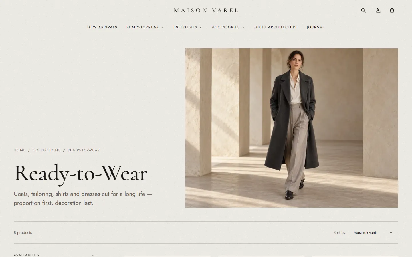
A closer look at how we work. Much of our client work is covered by confidentiality agreements, so we’re happy to walk you through relevant examples on a call.
Case study · Shopify theme · In-house
Arcella: quiet architecture for the storefront
The brief
Most Shopify themes for fashion look alike: a full-width slideshow, a product grid, a footer. We wanted a theme that feels like a printed lookbook, where products sit inside a story, while staying fast, accessible and easy for a merchant to run without a developer.
The approach
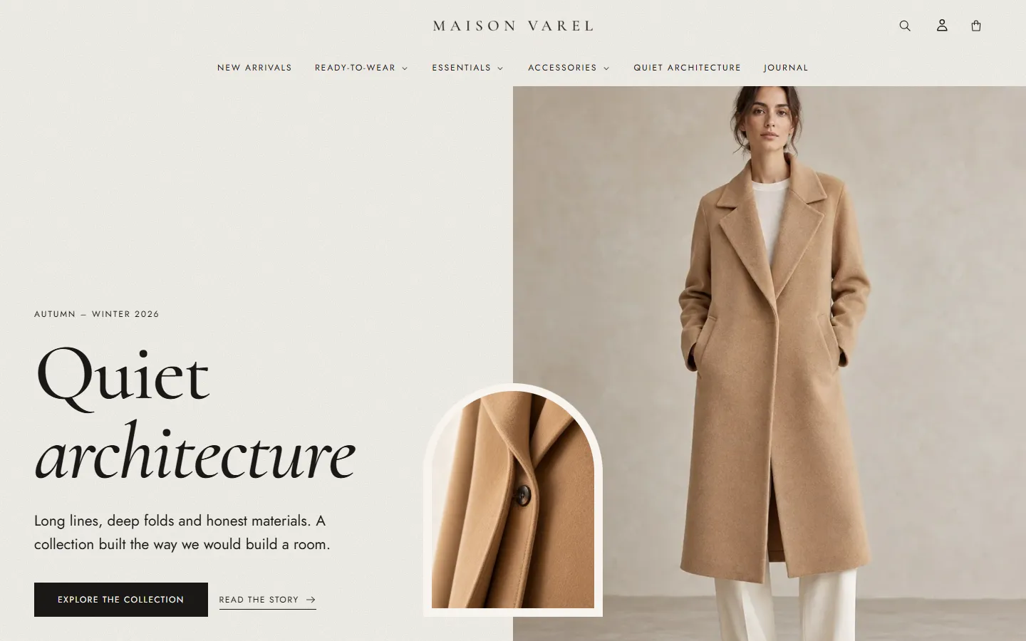
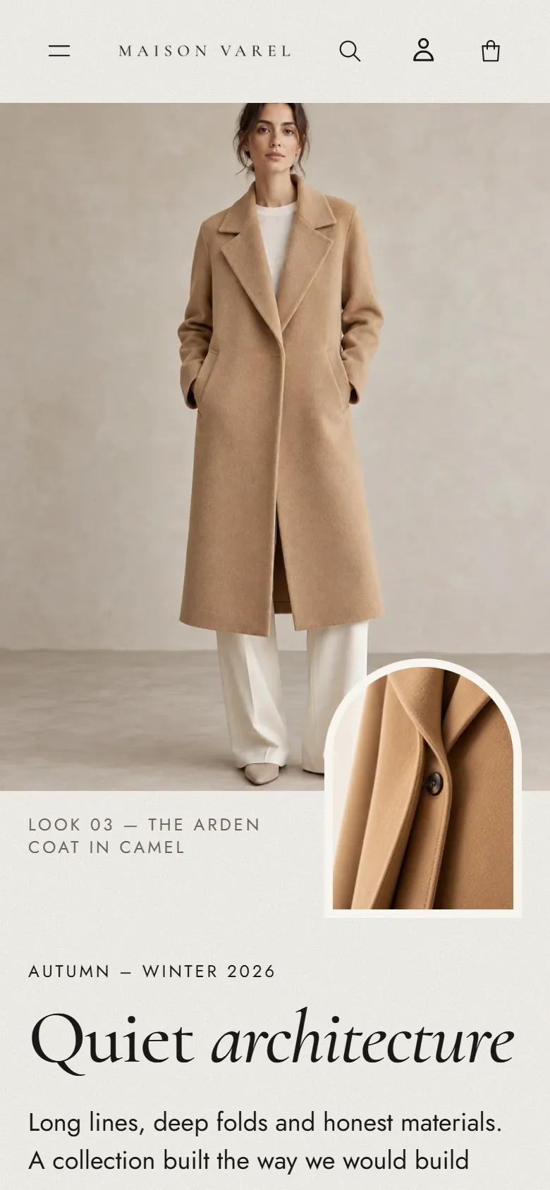
We started from an architectural idea: arches, margins and rhythm. That became a small set of signature details, each of which the merchant can turn off: an arched frame for editorial images, a faint paper texture, a chapter rail that names the story in view, and a “View” cursor over product imagery.
Underneath, the theme is built entirely on Online Store 2.0 sections and theme blocks. Grids align to shared rails so images, titles and prices line up exactly across columns, and motion is subtle, short and switched off for visitors who prefer reduced motion.
What we built
- A complete design system: color schemes, fonts and buttons controlled from theme settings
- Editorial sections: storytelling chapters, a shoppable lookbook, a mosaic collection list and a slow marquee
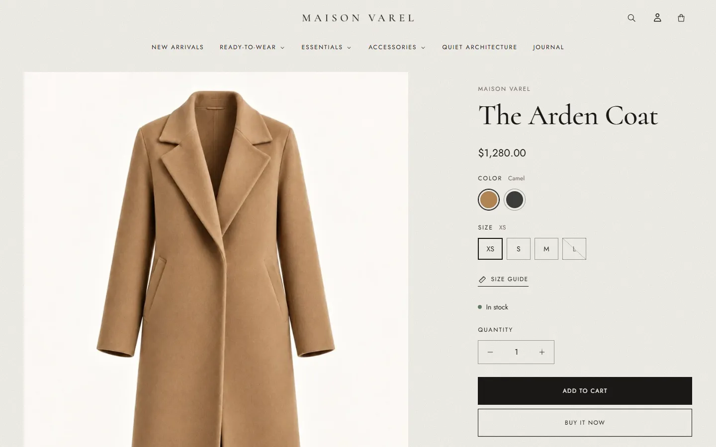
- A product page with swatches, a size guide panel, highlight icons and a “tailor’s ticket” for materials and care
- Filters, predictive search, a cart drawer with a free shipping bar, and mega menus with image cards
- A complete demo store, Maison Varel, with a full catalog, journal articles and policies
- Sixteen chapters of merchant documentation and a support process
How we checked it
Every template was tested with automated browser suites on desktop and mobile, in Chrome, Firefox and Safari’s engine, and scanned with axe for accessibility issues. Layouts were measured pixel by pixel to confirm alignment, then reviewed on real phones.